
Basic knowledge of intelligent stage lighting
With the popularity of stage performances, the stage lighting industry emerged as the times require and has become an important part of stage performances. Stage lighting is important to highlight the four major elements of visual atmosphere, realism, aesthetics and contrast. After years of evolution, it has gradually developed into a relatively complete and advanced stage lighting system today. The first prosperous period of drama appeared in ancient Greece more than 2,000 years ago, when the theaters at that time were all open-air or semi-open-air. The lighting of the stage depends on the huge “lamp” in the sky, the sun, so it can only be performed during the day. However, the demand for rest and entertainment at night, the objective disadvantages of open-air performances being easily affected by the weather, and the development of drama make stage lighting a problem that people must solve.
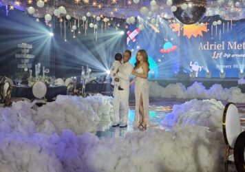
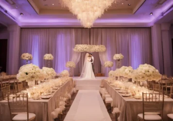
The success of the performance lighting design is marked by the proper handling of the stage lighting. Stage lighting should not only illuminate the actors, so that the audience can see facial expressions, demeanor and movements clearly, but more importantly, make full use of lighting technology, mobilize lighting operations and other means to enhance the artistic effect, so that the audience has a sense of being on the scene. Stage lighting is mainly the effect produced by the combination of computer lamps and other lamps. It is through different modeling scenes, different color changes, different viewing angles, changes in horizontal and vertical light angles, speed speed, strobe speed, and aperture size changes. , focal length change and other comprehensive performance. Then, before understanding the stage lighting technology, you must master these basic knowledge;
- Visible light
Light is radiant energy that travels in the form of electromagnetic waves. The wavelength range of electromagnetic wave radiation is very wide, and only the radiation with a wavelength of 380~760nm can cause light vision, which is called visible light. Light with a wavelength shorter than 380nm is ultraviolet rays, X-rays, and Y-rays; light longer than 760nm is infrared rays, radio waves, etc. They cannot produce light vision for the human eye and are invisible. Therefore, light is an objectively existing energy and is closely related to people’s subjective feelings.
- Classification of colors
Color can be divided into two categories: non-color and color. Achromatic refers to from white, light gray, gray to dark gray, until black, called white and black series. Pure white is an ideal object that completely reflects light, and its reflectance is 1; pure black is an ideal non-reflective object, and its reflectance is 0. Therefore, the non-color white and black series represent the change of the reflectivity of the object to light. The light reflectivity is proportional to the brightness, and the indoor white walls and ceiling can get higher brightness. Color refers to various colors other than the white and black series. Color has three characteristics: hue, lightness and saturation, known as the three elements of color.
Hue is an indication of the color that appears. That is, the names of various colors, such as red, green, blue, etc. It has to do with the wavelength of light. Value (brightness) is an indication of how bright a color is. The lightness of different tones is different, even if the same tone is affected by the nature of the surface of the object and the intensity of the light, there will be differences in light and shade and depth. If it is also yellow, it can be light yellow, medium yellow, deep yellow and so on.
Saturation (chroma) indicates the depth (shade) of a color, and it can also be said to be the purity and vividness of a color. The higher the saturation, the darker (thicker) the color appears, and all kinds of monochromatic light in visible light are the most saturated colors. The more white light is mixed into the spectral color, the less saturated it is. For example, red light is more saturated than pink light because white light is mixed into pink light. Generally speaking, in the same hue, when the lightness changes, the saturation also changes, but the increase or decrease of the lightness will reduce the saturation, and the saturation (purity) will be the largest only when the lightness is moderate. However, in people’s impression, I always feel that the color with high lightness always looks brighter.
- Three primary colors and color matching methods
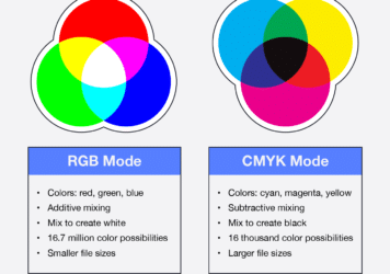
Red, green, and blue are called the three primary colors. These three colors are mixed in different proportions to produce various colors. There are two basic methods of color mixing: additive mixing and subtractive mixing.
The so-called additive color mixing is that when different colors of light are mixed, they add their respective parts in the spectrum together to produce a new method of mixing colors. Indicates the color-formation relationship of light-additive color mixing. When the three primary colors of red, green and blue are mixed in equal amounts, it can be obtained:
Red light + green light = yellow light Green light + blue light = blue light
Green light + red light = magenta light Red light + green light + blue light = white light
If unequal amounts of the three primary colors are mixed, various intermediate colors can be obtained, for example: more red light + less green light = orange light
More red light + less blue light = pink light
Subtractive color mixing is a method in which when different colors are mixed, each of them selectively absorbs the corresponding part of the spectrum they occupy from the incident light, thereby producing a synthetic color effect. If any two shades of light are added together to produce white light, the two shades of light are called complementary shades (complementary colors). For example, yellow and blue are complementary colors to each other, cyan and red are complementary colors to each other, magenta and green are complementary colors to each other. Therefore, yellow, cyan, and magenta are called minus blue, minus red, and minus green respectively, that is to say, the three complementary colors are formed by subtracting a corresponding primary color from white light. Therefore, yellow, cyan, and magenta can be called the three primary colors of subtractive color method.
When the three subtractive primary colors of yellow, magenta, and cyan overlap, black is produced. In the process of the subtractive color method, the density changes of the three subtractive primary colors control the absorption ratios of red, green, and blue respectively, so that various mixed colors can be obtained, which can achieve the same effect as the additive color method.
- Color and Vision
Colors can give people a sense of warmth, distance, size and weight, and often make people associate them, thus forming different psychological effects. These are people’s long-term visual habits.
Colors can usually be divided into three categories: cool colors, warm colors and neutral colors (intermediate colors). The coldness and warmth of colors are divided according to the visual responses and psychological associations caused by various colors to people. Red makes people think of the heat of fire, which creates a sense of warmth and is called a warm color. Blue makes people think of cold water and gives people a feeling of coldness, so it is called cool color. Purple and green are neutral colors that are neither cool nor warm. Different colors can affect the size of the object’s appearance. If some objects of different colors and the same size are put together, a light white object will be produced visually. Dark black objects are small. Generally speaking, white objects look the largest, black objects look the smallest, yellow objects are larger, followed by green, red, and blue.
People’s visual habit of color will also produce a sense of distance. Objects of different colors give people different visual perceptions at the same distance. Warm colors give the impression of moving forward, while cool colors give the impression of moving back. Moreover, the sense of distance given by the color is also affected by the color of the background. For example, when a white background is used, blue appears closer; when a black background is used, red appears closest, followed by orange, yellow, green, blue, and purple. Utilizing this feature can help us create an illusion effect of color three-dimensionality and distance.
The weight of color is also a visual habit that people have formed for a long time. It is generally believed that white is the lightest and black is the heaviest. Among the three primary colors, green is the lightest, blue is the heaviest, and red is in the middle. There is a color formed by mixing equal amounts of two primary colors of light, the light color appears light, and the heavy color appears heavy. The weight of color is not only expressed through brightness and purity, but also affected by the size of the area occupied by the color in the picture. Larger colors appear heavier and attract more attention than smaller colors.

Leave a Reply